Big Book Toy Finder
Innovation & Strategy, UX Research, IA
Innovation & Strategy, UX Research, IA
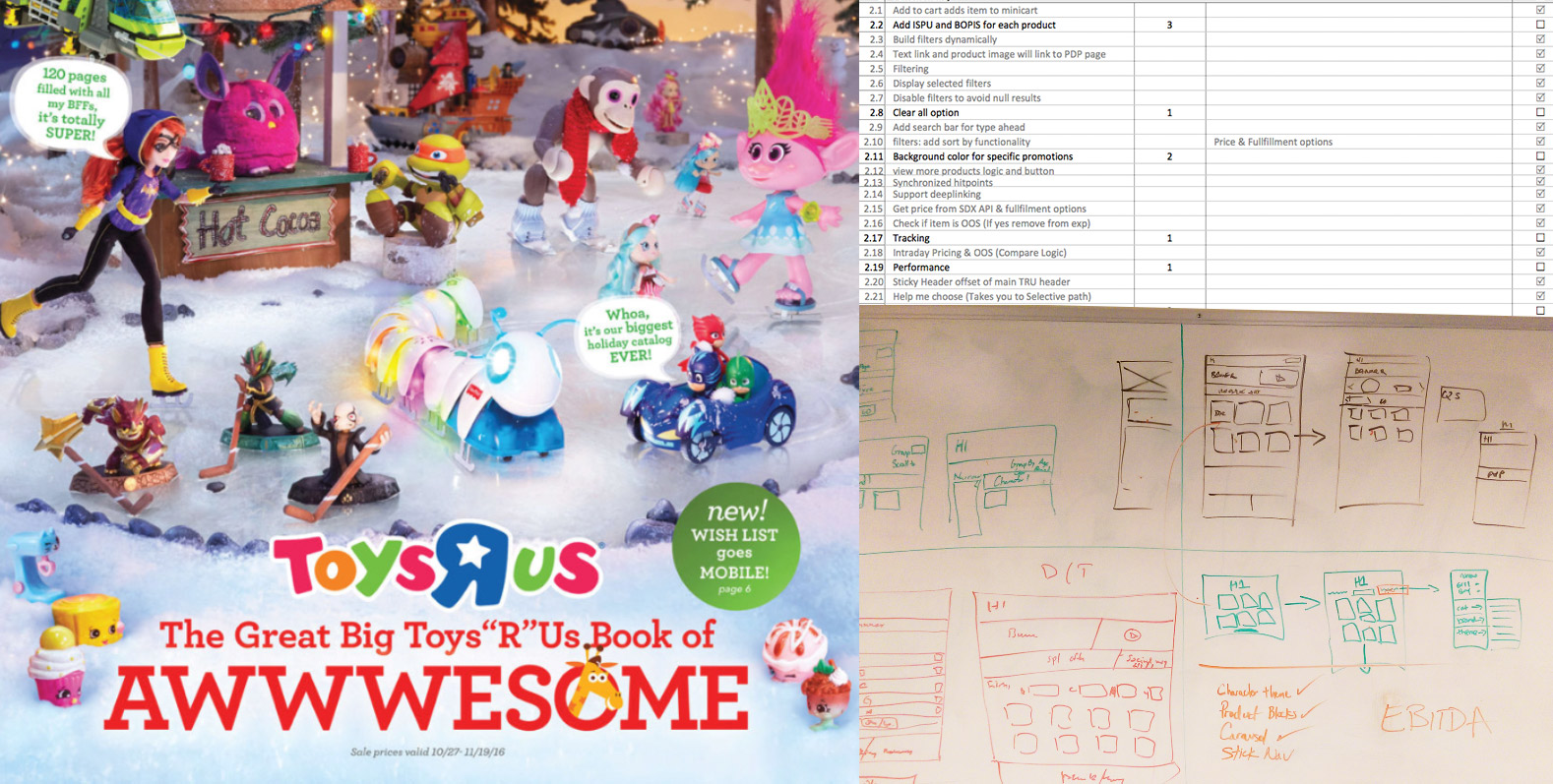
My challenge was to transform the Toys"R"Us’, Great Big Book of Awesome, printed catalog into a digital experience. Expected to go live for the holiday season, this was the biggest 2016 initiative for the company. To increase sales, it was imperative that each of Toys"R"Us hottest products were uniquely highlighted. Navigating a customer through the purchase funnel with ease of use and customer intent in mind was high priority. What made this project even more challenging was that the 2016 Great Big Book of Awesome had the highest number of products ever cataloged, a total of 120 pages.
Innovation & Strategy
UX Research & Analysis
Information Architecture
The original goal was to create a static landing page which then took customers to a family or category page. I championed the need to create an immersive digital experience by letting users find their products through two means; a toy finder and a guided tour via a single web application. In addition, I increased basket size by adding an add to cart functionality alongside every product. I collaborated with cross-functional teams to create a digital experience that made it easier for customers to shop products featured in the print catalog. Using industry best UX practices I architected the entire campaign from inception to completion by managing both design and development fronts. Both experiences were analyzed using adobe A/B testing to see whether the static landing page or the new proposed one would perform best.
Because there were so many products on mobile and desktop, 3,500 to be exact, we decided to load only the first 30 products on initial load. We then lazy loaded 30 products at a time after the user clicked on "view all" products. To increase the performance of the overall experience, we loaded all the images of the guided tour after the user clicked on "help me choose." This was a huge boost and saved about 3-4 seconds from the total load time.
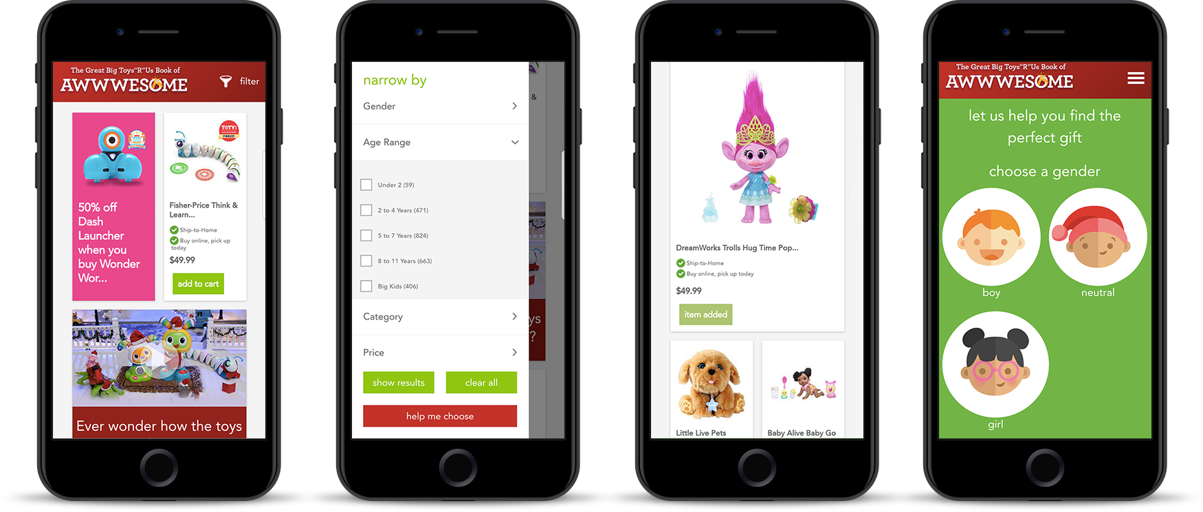
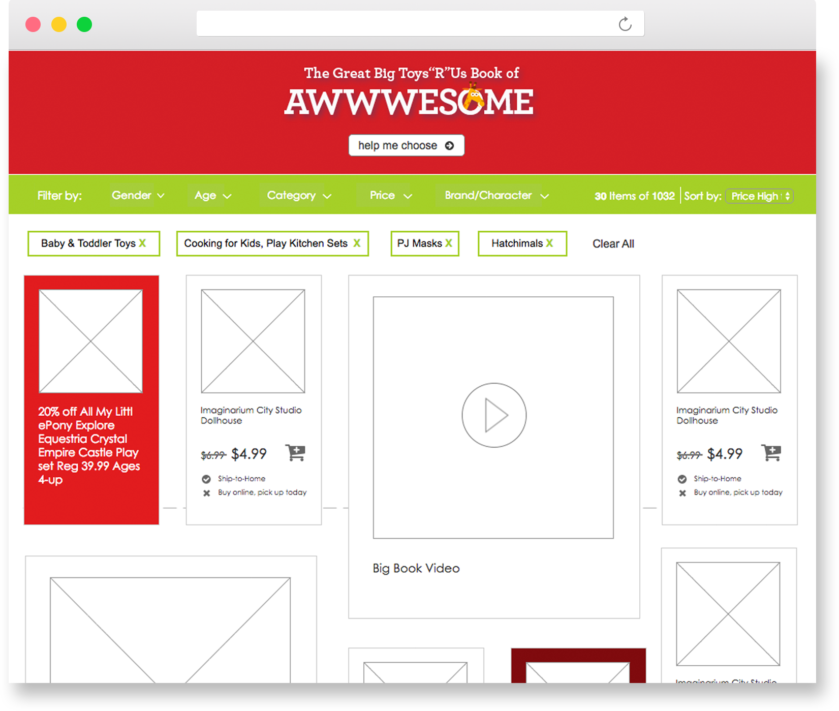
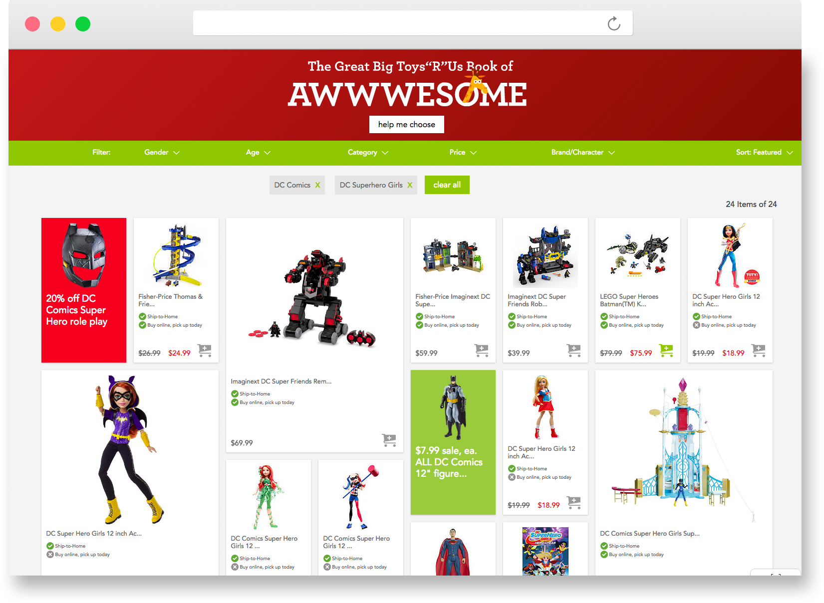
The Big Book Toy Finder featured multiple filtering and sorting options. As filters were applied, the product cards updated to display only relevant results. The filters also updated to show the quantity of product available and were grayed out when no products were available. The experience was hyper-promotional in that it promoted deals from the print catalog, as well as displayed them in their corresponding category as a solid color behind the product. For example, when you the user clicked on the barbie filter, they would see a barbie deal displayed.
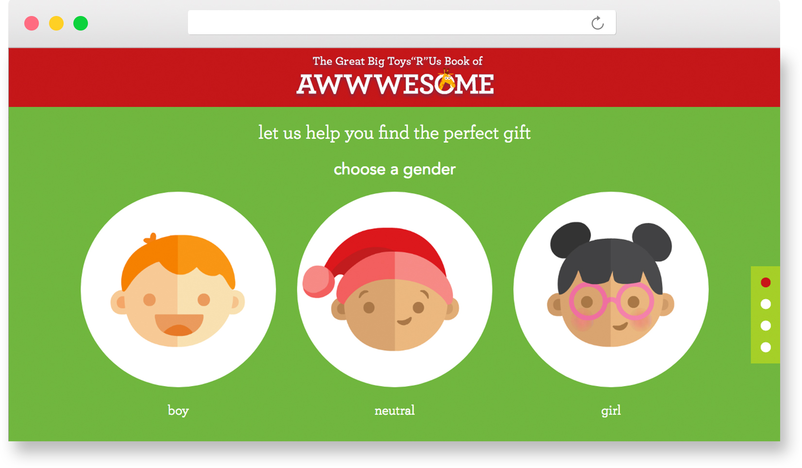
When the users clicked on the "Help me Choose" button, it switched to a tour guided experience so that users could select from a list of questions. This provided an additional layer of simplicity if a gift giver wasn't sure what to look for. The "help me choose" button was found to be clicked on roughly 50% of the time.
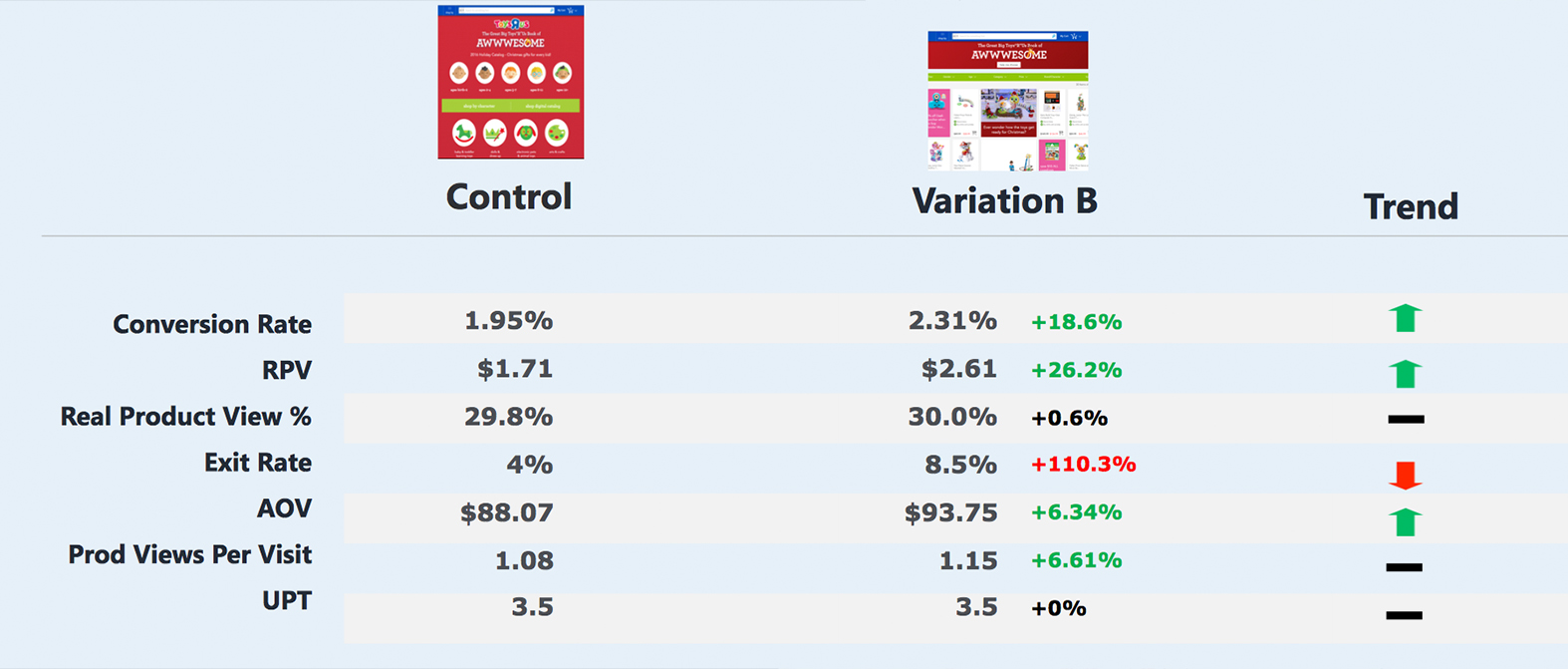
The Toy Finder outperformed the static landing page by a series of metrics. Conversion rate increased to +18% and revenue per visitor (RPV) increased to +26%. The Toy finder resulted in 5.2M in sales for Toys"R"Us during the holiday season! This was two and a half times more than the average revenue in previous years which were roughly around 1.9M.
One must be willing to take calculated risks to achieve success. There was opposition at first, however, with data supporting the need for this change we moved forward and it proved to be a success. The insight gained from this experience was ground breaking, it shifted our methodology in the way we pulled product information from a spreadsheet to the use of a third-party API intraday service. Going forward we now had the ability to create transactional content throughout the Toys"R"Us and Babies"R"Us guest-facing digital experiences.